YFP 2024
Pushing the boundaries of mixed media, I led YFP’s art direction with designs inspired by punk bands, Tumblr culture, and the digital destruction era—blending Procreate doodles with hand-lettered typography. Under this vision, the design team expanded in 2024, following this creative direction to solidify the YFP brand.
The work showcased here is solely my own, from concept to final execution. Each piece represents just one part of a broader collection of social graphics, designed to explore different styles and creativity while staying true to our brand. In YFP’s color system, orange represents our main roster, while blue signifies our secondary roster—dedicated to creating competitive opportunities for women and other marginalized genders.
For a look at the full creative direction and contributions from our team, check out my Behance page.
If you like some of the doodles featured here, they are available for purchase on my Gumroad for both personal and commercial use.
Role
Creative Director - Feb 2024 to PresentLead Designer - Oct 2023 to Feb 2024Timeline
Jan 2024 - Dec 2024Skills
Art Direction
Social Media Design
Motion Design
Animation
Merch Design
Typography
Tools
Adobe Photoshop
Adobe Illustrator
Adobe After Effects
Procreate
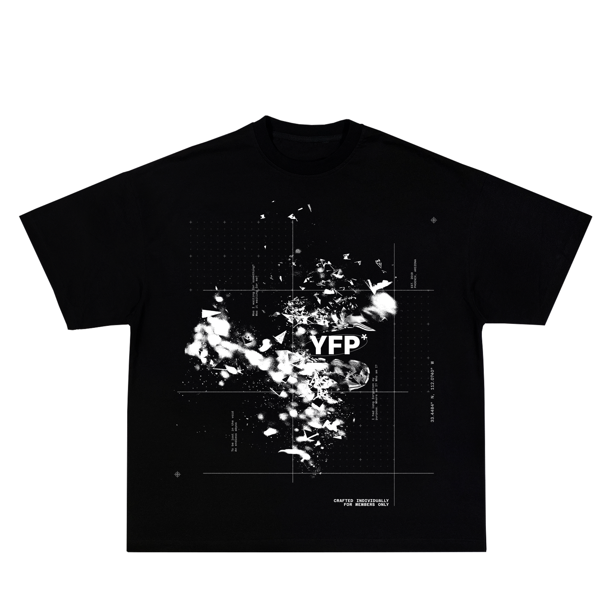
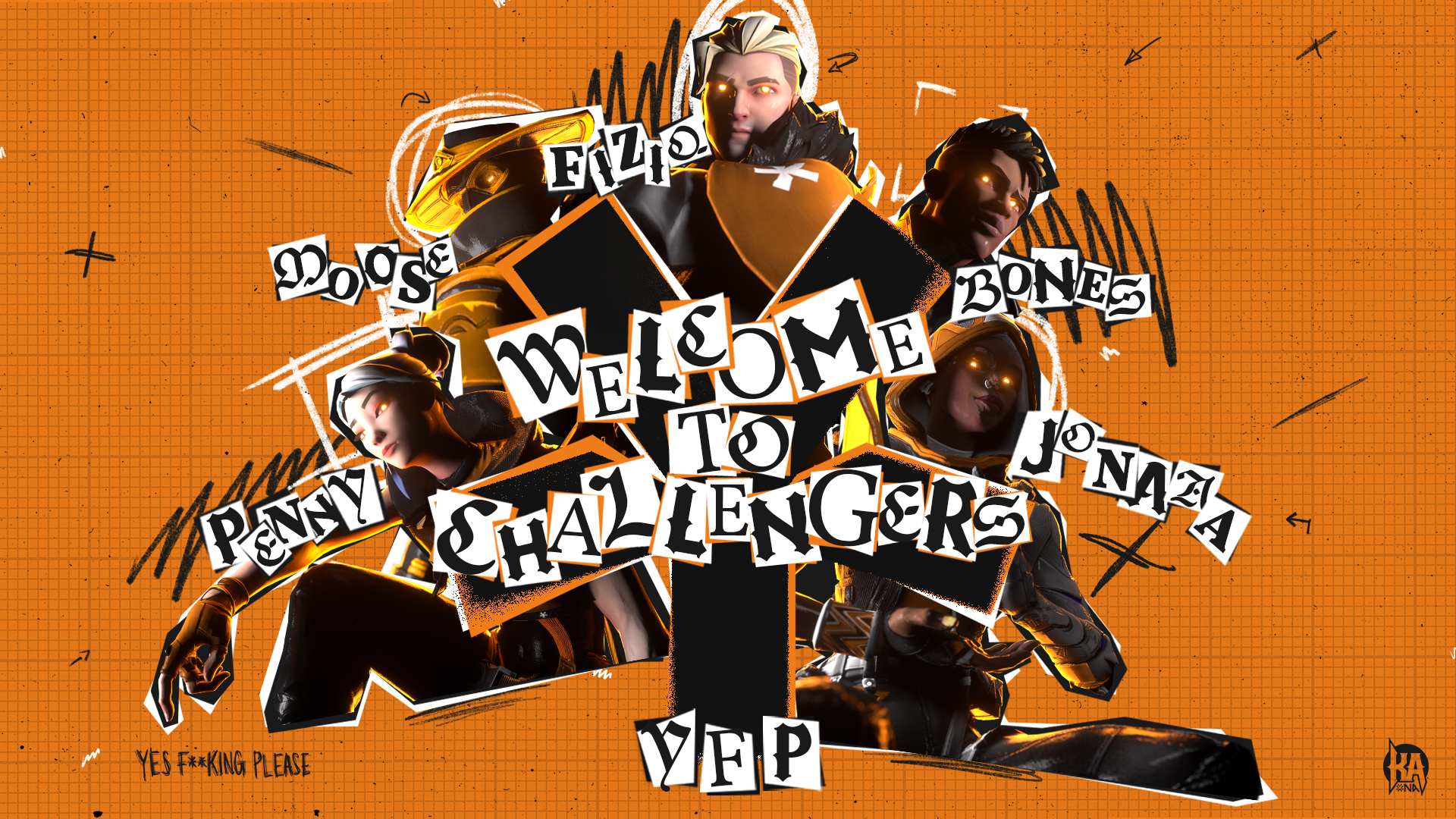
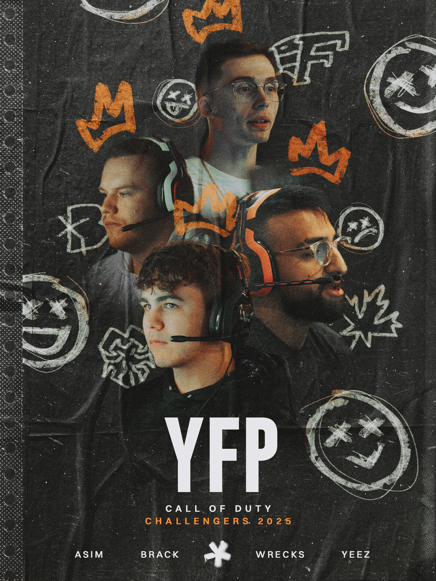
YFP (MAIN) BRAND
*
YFP (MAIN) BRAND *
YFP’s focus has been on Valorant—a game with an audience that thrives on high-quality renders and a deep appreciation for textures.
So, how do you stand out? In a landscape where designs often feel templated, colors blend together, and an oversaturated market pushes creatives to prove themselves, differentiation is everything.
During my time at YFP, I explored custom doodles, unique illustrations, bold typography, and 3D modeling. While most esports teams rely on character poses showcasing signature skills or combat stances, I proposed a different approach—one that breaks conventions from standard esports.
Why not push boundaries, challenge expectations, and see who’s willing to rise to meet us?


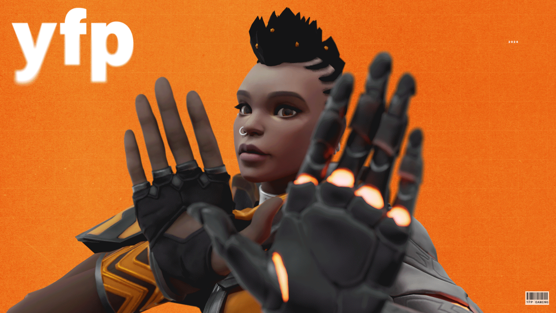
YFP X BRAND
*
YFP X BRAND *
Esports often involves multiple teams and games, and to distinguish them, organizations typically expand their brand’s image with new colors and styles to cater to different audiences.
To create a story and visual identity that stayed true to the brand standards, YFP X drew inspiration from both historical and industry trends while reflecting the main YFP brand. YFP’s core brand followed Helvetica, aligning with postmodernism. When the main brand took on a postmodernist, punk, and grunge approach, I explored digital destruction. As the organization shifted away from hand lettering and leaned toward a more corporate style, I embraced humanistic design principles by creating everything by hand. This customization allowed the designs to stand out and differentiate from the crowd.
Each piece can stand on its own, but together, in alignment with the main YFP brand, they tell a story rooted in design and art history. One cannot exist without the other.


For our YFP GC team, also known as YFP X, we introduced an African inspired art style with some frame-by-frame animations to distinguish themselves from the YFP main roster.
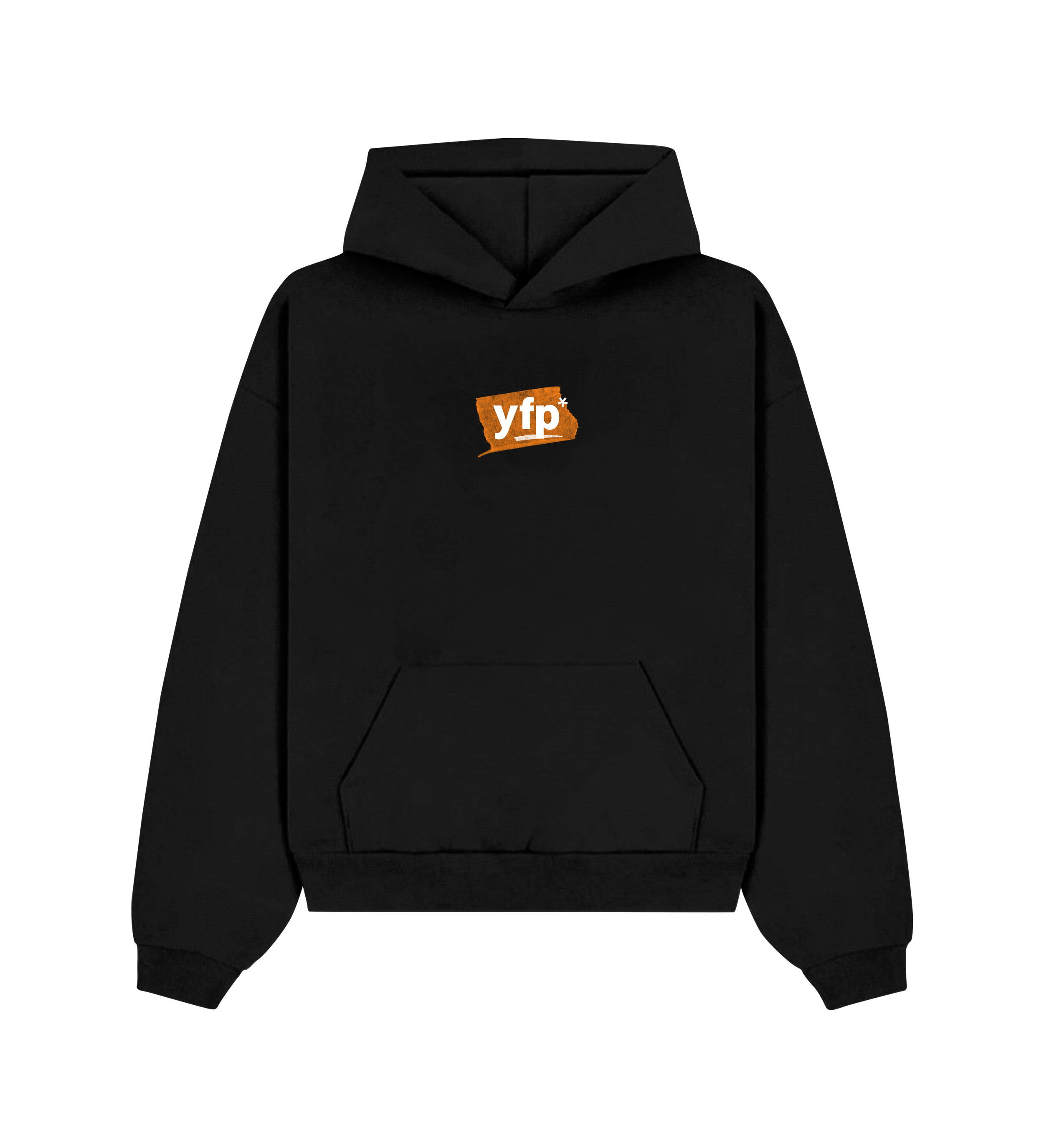
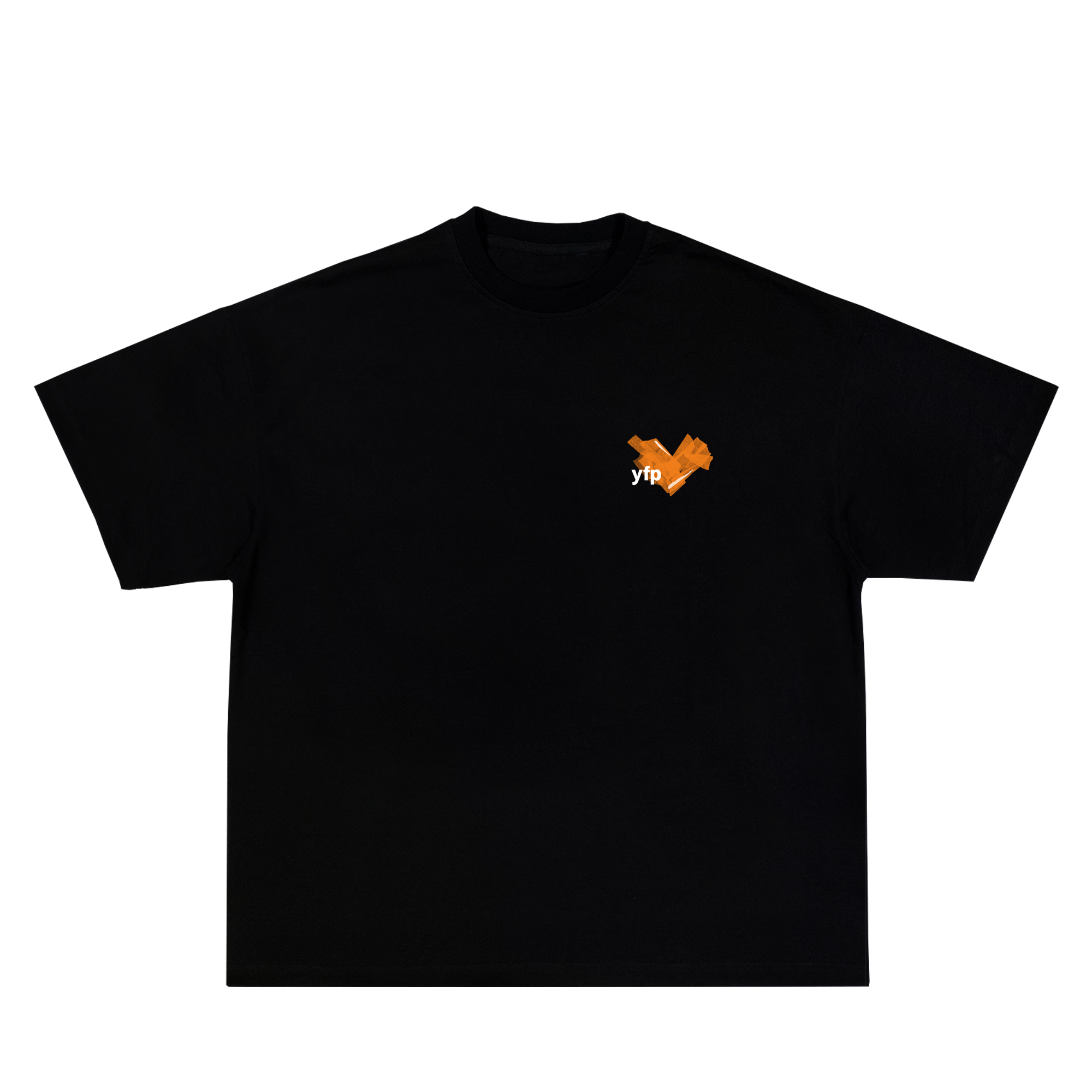
YFP MERCHANDISE
*
YFP MERCHANDISE *
Passing the Trenches was the final collection of merchandise for 2023 and the final for this version of YFP prior to the visual update we knew we wanted.
Although fans did not know it at the time, this set of merchandise was a teaser to say goodbye to the old and hint at our visual update before we made any official announcements.